
Which Artwork File is best?
Today there are many design programs out there. So which one is BEST for your artwork and exporting print-ready files? Some may opt to use one or another design program, keeping the user interface in mind. In the print industry, Adobe continues to be one of the favourites for preparing print-ready artwork. Printers may opt to get the exported print-ready artwork in PDF format or they may request the source files (the original design program and all associated files for the artwork design). These types of artwork files are not only a universal file format used among clients, printers and designers but are also able to support high-quality images and vectors within your design. Most printers can print directly from a PDF file, but there is no harm in contacting them to find out what artwork files are compatible with their systems.
Guidelines, where to use them
Before your artwork is finalized for print, it is highly recommended to consider a safety line, trim line, and bleed area. If you do not factor these into your design, it can result in issues in your printed products. For example, essential text that is cut off, white areas where there was supposed to be an image or even a product cut to the wrong size. Using Adobe Illustrator as a reference, it supports having these guides that can be set as an overprint. Meaning your artwork will continue to carry these details over through the proofing process and onto the printers. Providing clear instructions to all parties involved leading up to the final printed product.

Click to enlarge image.
- Safety Line: This is the area in your design where you want to keep all visuals you wish not to be cut off during the trimming/cutting process.
- Trim Line: This is the line along which your design is cut to size or shape.
- Fold Line: These are the lines along which the final print is folded. Folding lines are quite useful in the design of pamphlets, books, and packaging.
- Bleed Area: This is the extra part of your design, going past the cut area. So if your design is using design elements on top of the cut area, it is best to have it continue into the bleed area.
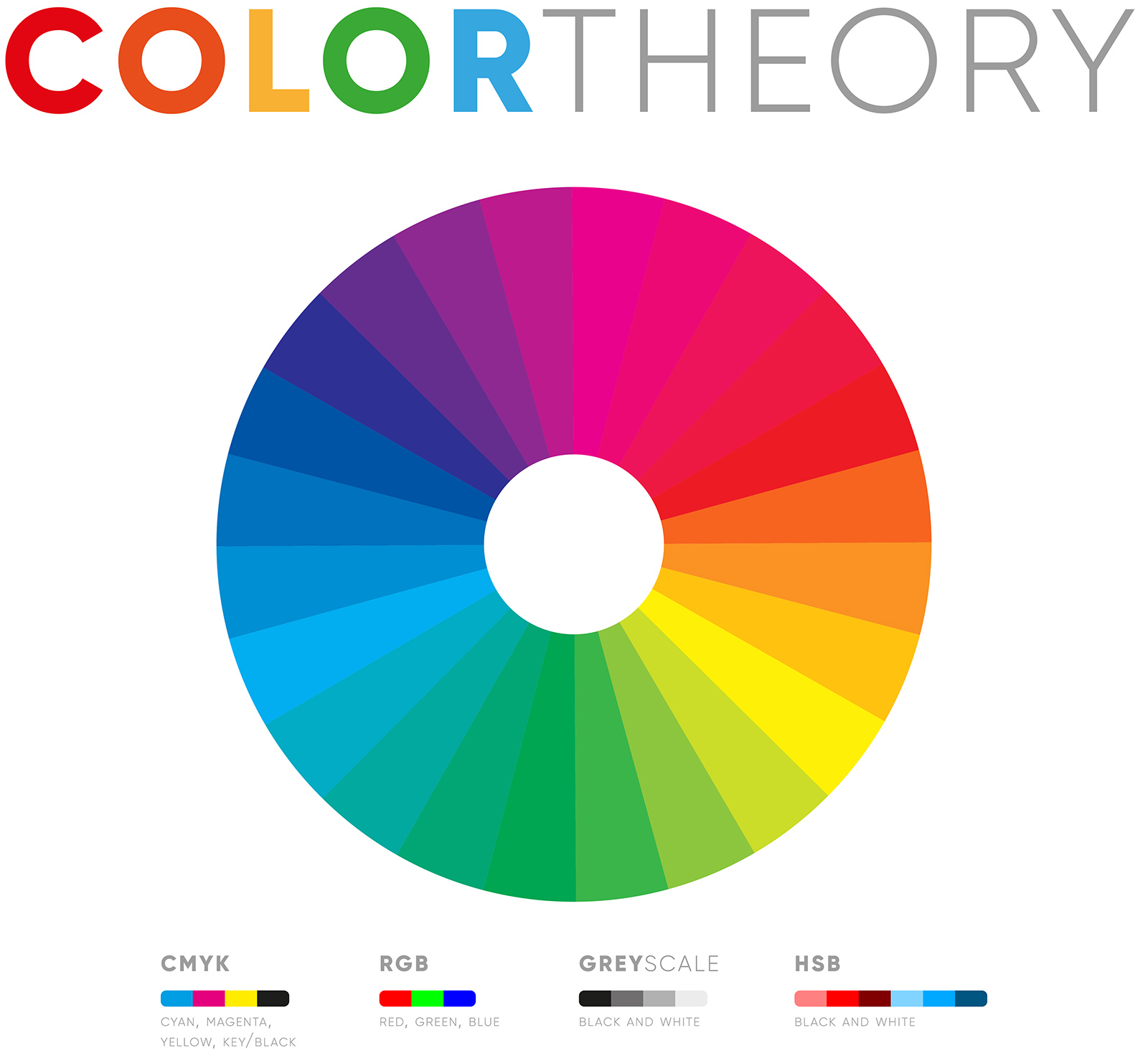
When and what colour modes to use in the design process
There is a major difference between RGB colours in design and CMYK. RGB is a subtractive colour system where CMYK is additive. RGB uses the colour white as a combination of all the primary colours and black as the absence of light. Whereas CMYK uses white as the natural colour of the print background and black as the combination of coloured inks. In essence, RGB is used for website usage and CMYK is meant for print usage. If you were to take an RGB file into print, the colours would not be as vibrant as you would see them on your electronic device hence it is best to design and work in CMYK from start to finish.
Click to enlarge image.
Believe it or not, CMYK has its limitations; these limitations may include not being able to produce the colour you want with the same vibrant colour. Hence, Pantone colours bring a level of accuracy when it comes to printing. Although Pantone colours bring forth the best quality colours and accuracy, it is more expensive than printing in CMYK because of certain steps to print a Pantone colour, as Pantones are printed individually unlike CMYK. The more Pantone colours you have, the more colour plates or screens are needed. In essence, if you are wanting consistent colour values, then Pantone colours are for you. However, CMYK is the ideal option for print tasks that require a large number of colour combinations and fine detail.

Embedded Fonts
The internet is filled with thousands of fonts! Most of which are only available when purchased or as part of a subscription. It is understandable then, why your preferred printer may not own your favourite font that you used in your artwork. This would result in your printer being unable to print your artwork if the fonts are not embedded or converted to outlines. Most design software, for example, Adobe Illustrator, has a way to convert editable text into outlines, where it is no longer a piece of text but rather an object. Although a font may be embedded in your file by default when exporting to a PDF, outlining your fonts is an extra safety measure.
Low-Resolution Artwork Files
Preferably, you would want your final artwork to be printed in the best quality possible, however, it is best to ensure that from your end you are exporting your artwork in the correct PPI. The minimum value for reasonable print quality is 180 PPI, for a better image quality you may go up to 240 PPI but the best quality is 300 PPI. However, PPI is the pre-print preparation that you make use of on-screen. Whereas DPI comes into play once you hand over your artwork to the printers. Although often confused, there is a major difference between PPI and DPI.
DPI is referred to as dots per inch. These dots, however, are small ink dots, not square graphic elements. A print is made by spraying tiny droplets of ink onto the paper. PPI stands for Printed Pixels per Inch, this refers to the number of pixels that a screen can display and the density of the pixels within an image. Therefore, to resolve a low-resolution error, make sure to raster your images to a resolution of 300 PPI before placing them into the print file.
Double and Triple Check!
Don’t forget that when going into print, not only do you need to make sure your colours and resolution settings are correct. It is important to run a spell and grammar check as this simple step is surprisingly easy to forget. Before delivering your artwork or exporting your high-resolution PDF, double-check everything – this may be a costly mistake otherwise. Most software and applications have a built-in spelling and grammar checker. However, if your chosen software does not have this feature, perhaps it is best to make use of an external program like Microsoft Word to do a spell and grammar check.
